GA4 dashboards is no longer a side topic for digital teams. In 2026, discovery is shaped by search engines, AI assistants, answer engines, social platforms, maps, and the quality signals that connect them. The businesses that win are the ones that make their expertise easy to understand, easy to verify, and easy to retrieve.
For Synbus clients, this means the work has to move beyond isolated tactics. A page can rank, load quickly, and still fail if the message is vague, the structure is weak, or the next action is unclear. A modern article, landing page, dashboard, or workflow should explain the topic, support the reader, and connect business goals to measurable outcomes.
This guide gives a practical framework your team can use before investing in another campaign or redesign. It focuses on the decisions that affect search visibility, user trust, operational speed, and conversion quality. The examples are written for growth-focused businesses that need clear execution, not abstract theory.
Why this matters now
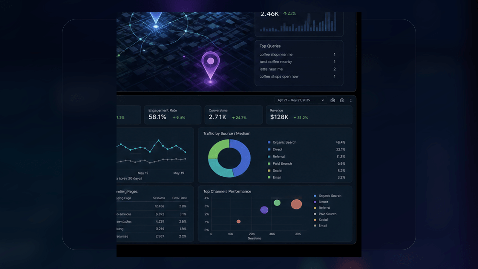
GA4 can be powerful, but many teams still struggle to translate raw reports into decisions. The dashboard should not be a wall of charts. It should answer practical questions about traffic quality, conversion paths, campaign performance, and business outcomes.
Teams often notice the problem only after performance becomes inconsistent. Traffic may look healthy while leads become weaker. Content may be published regularly while few pages earn visibility. Tools may be added to the stack while reporting remains unclear. The better approach is to design the system before the symptoms become expensive.
A strong system gives every stakeholder the same map. Leadership can see what is improving, marketing can prioritize the work that moves demand, sales can understand which pages create qualified inquiries, and technical teams can fix the blockers that limit growth.
What the strategy should include
A useful dashboard starts with questions. What channels create qualified leads? Which landing pages convert? Which campaigns bring poor traffic? Where do users drop off? What changed this month?
1. Clear intent and audience mapping
Start by defining what the visitor or searcher is trying to accomplish. Some people want a definition, some want a checklist, some are comparing vendors, and some are ready to request a quote. The page or workflow should match that intent with the right depth, proof, and next step.
2. Strong structure for humans and machines
Use clear headings, concise sections, descriptive anchor text, and structured answers. This helps readers scan the page and helps search engines understand the relationship between entities, services, problems, and outcomes.
3. Technical quality behind the experience
Speed, crawlability, schema, media weight, indexation, accessibility, and mobile usability are not secondary polish. They are part of the experience. A technically weak page can limit both rankings and conversions even when the content is useful.
4. Measurement that supports decisions
Analytics should show what visitors did, where they came from, and which actions created business value. Good measurement turns guesswork into prioritization. It also makes it easier to explain why a campaign, redesign, or automation project deserves investment.
Practical implementation checklist
The fastest way to improve performance is to convert the strategy into repeatable checks. Your team can use the list below before publishing a page, launching a workflow, or approving a redesign.
- Define conversions before building charts.
- Separate acquisition, engagement, conversion, and revenue or lead-quality views.
- Use events that describe meaningful actions, not every tiny interaction.
- Connect GA4 with Looker Studio for stakeholder-friendly reporting.
- Annotate changes so performance shifts are easier to explain.
Implementation phases
A practical implementation should be phased so the team can learn quickly without creating unnecessary risk. The first phase is discovery: review the existing pages, data, tools, rankings, workflows, and conversion paths. The second phase is prioritization: decide which fixes protect current performance and which improvements can create the largest lift. The third phase is implementation: update content, technical structure, tracking, design, and workflow logic in a controlled order. The final phase is measurement: compare results against the baseline and decide what should be improved next.
This approach is especially important when the website already has organic visibility, backlinks, indexed URLs, or active lead generation. A rushed change can remove useful signals. A phased plan helps the team keep what is working, fix what is limiting growth, and avoid launching changes that look good in isolation but weaken the full customer journey.
What teams should measure
The right metrics depend on the goal, but the best dashboards usually connect visibility, experience, and business outcomes. Search visibility shows whether the content can be found. Engagement shows whether people understand the page. Conversion tracking shows whether visitors take meaningful action. Operational metrics show whether the team can repeat the process without slow manual work. When these metrics are reviewed together, decisions become clearer and less emotional.
For example, an article might bring traffic but no inquiries because the call to action is weak. A service page might convert well but fail to rank because the topic coverage is thin. A workflow might save time but create inconsistent quality if review rules are missing. Measurement should make those tradeoffs visible before the team invests more budget.
How to maintain quality over time
Digital systems decay when nobody owns maintenance. Search behavior changes, competitors publish better content, tools update, tracking breaks, and pages become outdated. A good maintenance rhythm includes monthly performance review, quarterly content updates, periodic technical checks, and a clear owner for each major workflow. This keeps the system useful after the initial launch.
Quality also depends on documentation. Teams should keep a record of page goals, target audiences, focus keywords, internal links, schema decisions, tracking events, and approval notes. That documentation makes future updates faster because the next person does not have to rediscover why each decision was made.
Common mistakes to avoid
Analytics fails when it becomes decorative reporting instead of decision support.
- Tracking too many events without naming rules.
- Reporting traffic volume without lead quality or conversion context.
- Mixing paid, organic, referral, and direct data without clear channel definitions.
- Creating dashboards that only one technical person can understand.
None of these mistakes are unusual. They happen when teams treat digital growth as separate projects instead of a connected system. The solution is not more noise. It is better planning, cleaner execution, and stronger feedback loops.
How Synbus approaches this work
Synbus builds dashboards around decisions. We clarify KPIs, repair tracking, structure events, and create reporting views for marketing, sales, leadership, and technical teams.
Depending on the project, that may include analytics tracking and dashboards, CRO and UX strategy, and technical SEO. The goal is to create a reliable growth system, not a one-time asset that becomes stale after launch.
Recommended internal reading
To help visitors and search systems understand the topic cluster, this article connects to related Synbus services and supporting pages. These internal links make the site easier to crawl, give readers a logical next step, and reinforce the relationship between strategy, implementation, and measurable business results.
Helpful external references
High-quality outbound references can support trust when they point to useful documentation or reputable sources. The goal is not to send visitors away from the page, but to show that recommendations are aligned with broader search, analytics, performance, and automation best practices.
- GA4 events documentation - for planning meaningful event tracking.
- Looker Studio help - for dashboard reporting and visualization setup.
- GA4 conversions guidance - for measuring business actions clearly.
Example workflow
A dashboard for a service business may include landing page sessions, source quality, form starts, form completions, call clicks, qualified leads, and month-over-month changes. That gives the team a shared view of what is working.
A useful workflow usually starts with a small audit, moves into a prioritized implementation plan, and ends with reporting that shows what changed. This keeps the work practical. It also helps teams avoid chasing every possible improvement when only a few changes will create the strongest business impact.
FAQ
Is GA4 enough by itself?
GA4 stores valuable data, but many teams benefit from Looker Studio dashboards that translate the data into clearer views.
What should a marketing dashboard include?
Traffic source, landing page performance, conversions, campaign quality, trend changes, and notes about major site or campaign updates.
How many events should we track?
Track meaningful actions first: form submits, call clicks, quote requests, key downloads, bookings, and important engagement points.
Can dashboards help SEO?
Yes. They can connect organic traffic, landing page performance, conversions, and technical changes so SEO work is easier to evaluate.
Next step
If your reporting is hard to explain, simplify the dashboard around business questions and make sure every metric supports a decision.
For a broader planning conversation, visit the Synbus contact page and tell us what you want to improve first: rankings, speed, conversion, reporting, or automation, then turn that priority into a focused implementation plan.
Google Search documentation is also a useful reference for understanding how technical quality, helpful content, and structured data work together.